Scentbird: redesign for retention

User retention is essential for a subscription service such as Scentbird.

My goal was to help people pick and queue more fragrances.

I interviewed 17 power users to find out how they picked fragrances online. I verified the qualitative findings with quantitative research (product data) and data from the customer support team.

I prioritized three areas of improvement: fragrance discovery, navigation, and recommender.

Every hypothesis was A/B tested.

Fragrance subscription service
Product manager and designer
July 2019 → February 2020
New York City, USA
Publihed in September, 2023

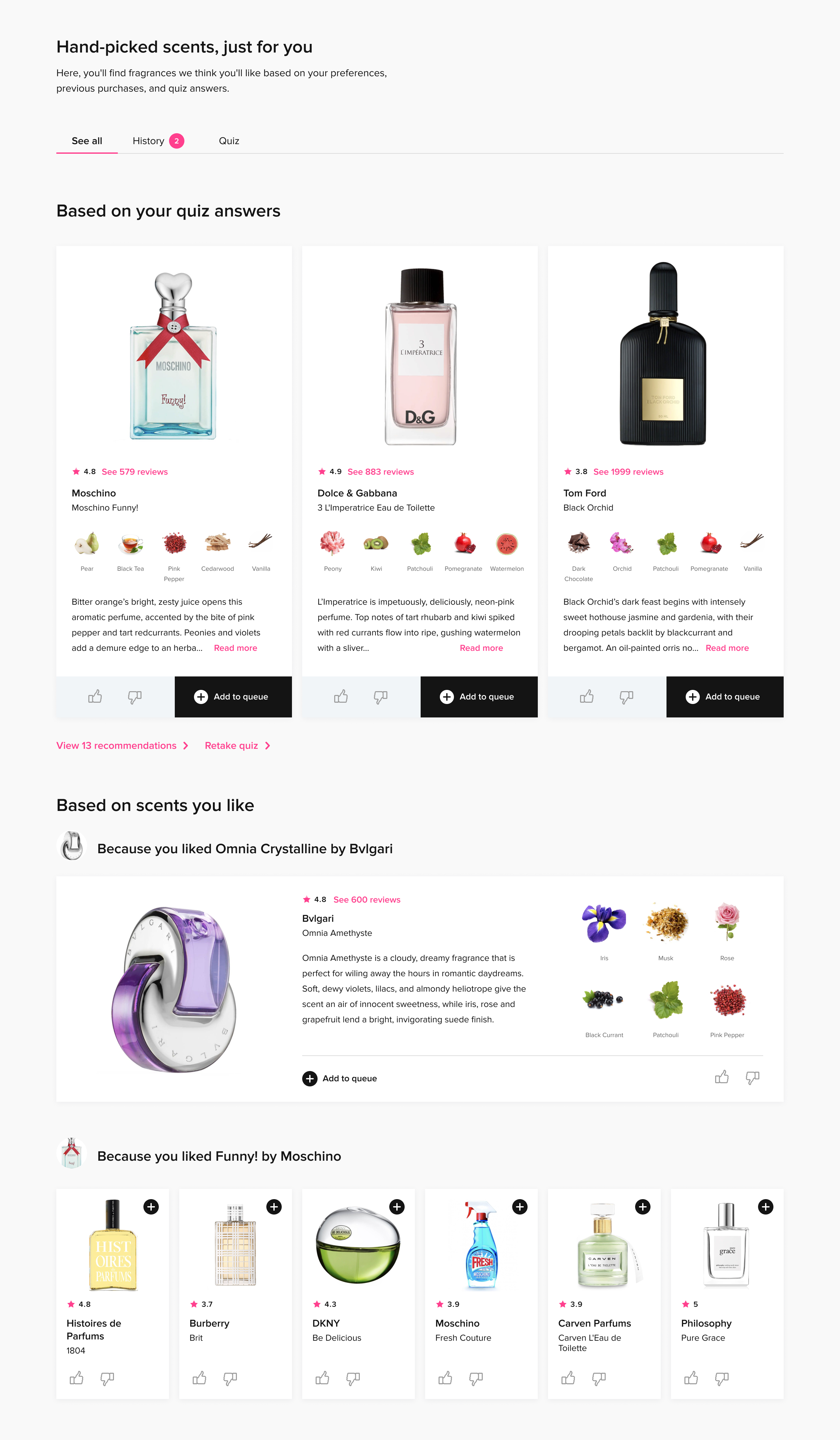
A product card that helps to pick fragrances online

A bigger product card brought important information to the forefront, making it easier for users to select fragrances that matched their preferences. I added notes, a ratings and reviews ratio, and descriptions.

Users queued 50% more products from these cards.

Here, I've recreated them as React components for you to play with:

See 579 reviews
Moschino Funny!
Moschino
Vanilla
Pomegranate
Peony
Patchouli
Moschino Funny! Is an uplifting perfume by Moschino launched at the end of spring 2007. It is a floral-fruity funny fragrance for young girls. The composition opens w...Read more
Add to queue
See 137 reviews
The One
Dolce & Gabbana
Pomegranate
Vanilla
Peony
Patchouli
Musk
The One is a contemporary and graceful fragrance that embodies the spirit of modern femininity. The top notes of tuberose and jasmine create a floral and enchanting o...Read more
Add to queue
See 1893 reviews
Black Orchid
Tom Ford
Pomegranate
Vanilla
Peony
Patchouli
Musk
Black Orchid is opulent and classically dark; its fragrance is in line with the best creations of the best perfume houses. A luxurious and sensual fragrance with a ri...Read more
Add to queue

The product card had about a dozen variants for different use cases, from exploration pages and recommender results to search results and pages with filtered products.

UX
User research
A/B testing
UI design
React

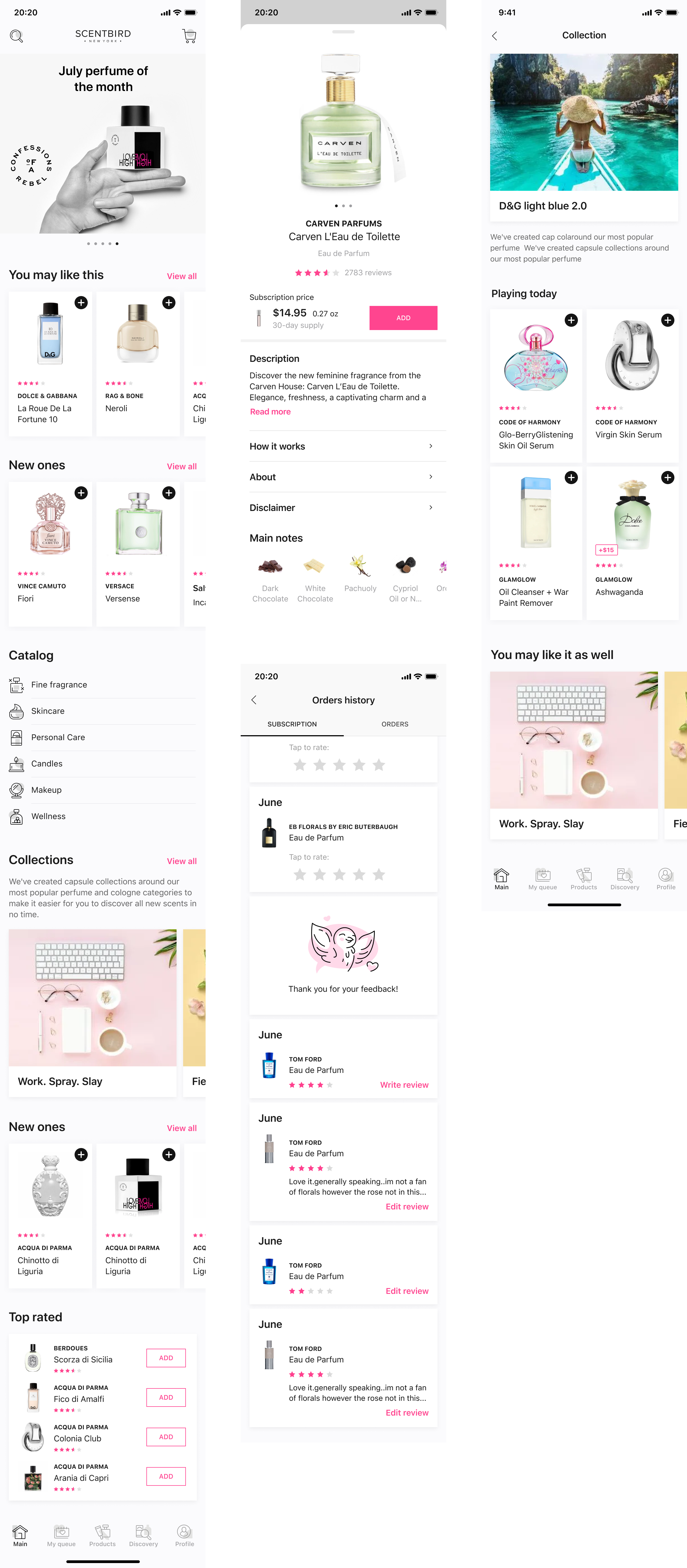
Mobile navigation overhaul to help users find crucial information

My research and the behavioral data showed that people couldn’t find their subscription status, that it was difficult to explore using mobile, and that the catalog was confusing.

Keeping in mind that 90 percent of users accessed the website from their mobile devices, I redesigned mobile navigation so that users accomplished their tasks reliably and 20% faster.

Here's the video with the result that went into testing (hover or tap to pause or resume):

To rethink the information architecture, I gathered insights through card sorting, onsite user interviews, and tree sorting, and I explored five prototypes. We launched an A/B test on three primary user groups. In addition to the UX improvements, the redesign led to a decrease in customer support tickets.

User research
UX
A/B testing
UI design
Prototyping

Modular information architecture: improve onboarding and first-month retention

Right after registration, people experienced difficulty picking fragrances. Instead of creating explainer videos, pesky pop-ups, and tooltips, I introduced modules that addressed specific problems and helped users to accompish their tasks. I did some light restyling and introduced elevated cards to focus users on what’s more important and actionable.

Here are some examples:

Fix the shipping address issues

Users quite often misspelled their addresses during registration. I decided to show them the delivery address so that they could change it right away. The test showed at least 1,600 users fixed their addresses after registration, saving us from shipment issues and time-consuming customer support.

Filter fragrances by the most popular notes

New users struggled to pick a fragrance, so I illustrated for them how notes are important for a fragrance, and they started exploring based on what is popular. This section and the resulting pages quickly became one of the top-five sources for users adding fragrances to their queues.

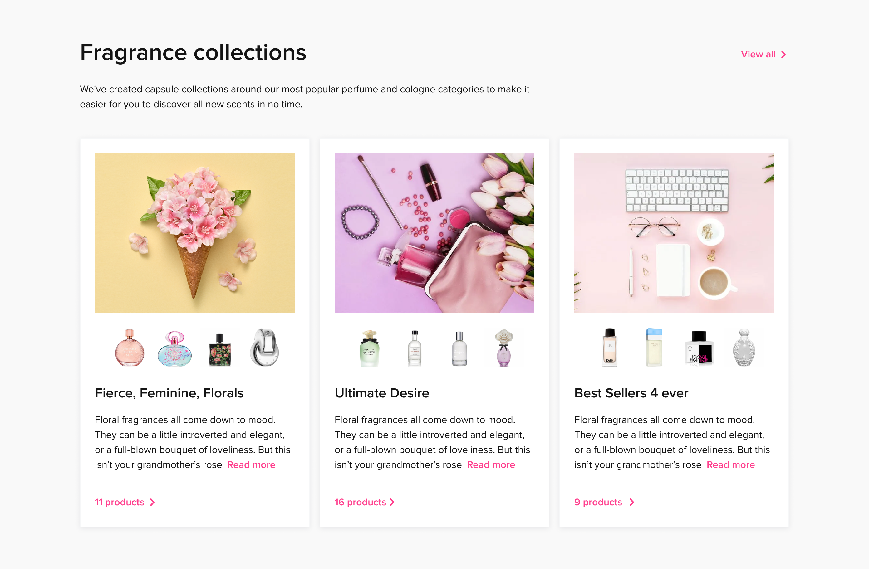
Pick more fragrances from the collections

With an expert curating each collection, it is easier to think of them as playlists or mixtapes. Each collection fits the central theme, serving as a convincing reason to try the suggested fragrances. This section quickly skyrocketed to be a top-3 source for customers adding products to their queues.

Perform a subscription upgrade

I am especially proud of this one. The UI was cluttered with upgrade promos, but they didn’t perform well. We removed 15+ banners from the UI and replaced all of them with this section, and it still performed better.

All promotions in one place

Cross-promotion was all over the place because of experiments, and I removed all other mentions and collected them in one place. All promos were combined on one page, and power users used them to get the best deals.

Each module was developed simultaneously for desktop and mobile. Some of the new modules made significant improvements on their own, e.g., users added more products to the queue from sections like Collections and Notes, and we saved lots of subscribers just by double-checking the shipping information. The new information structure made it easier for first-month subscribers to focus on fragrance and form their queue.

UX
A/B testing
UI design
Onboarding